
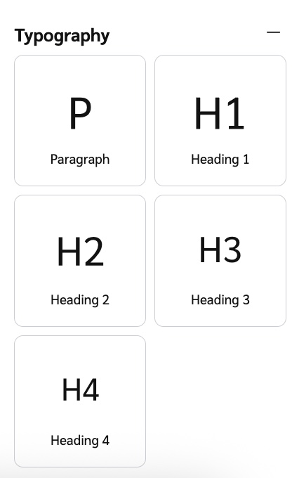
Components are the individual building blocks, like hero images and task cards, that make up your Advocate program's widget or microsite. These elements shape the participant experience and can be customized to align with your brand.
This article provides a categorized list of available components within the widget and microsite editors. Most components support styling and customization, though some have design limitations. You can also preview your component states within the editor interface.
Use Statistics components to let your participants know how they’re doing in your program. For a list of statistics these components can support, visit Widget and Microsite Statistics.
Component | Description |
|---|---|
Points Balance | Shows the participant’s Points balance. Used in Advocate programs that reward participants with points. 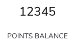 |
GiftCards Earned | Shows a count of gift card rewards earned by the Advocate. 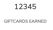 |
Referrals | Displays how many referrals the participant has made. Includes started and converted referrals. 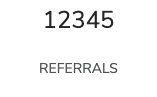 |
Container with Three Stats | A template with space for three statistics. The statistics displayed can be changed. Statistics and be added and removed as desired. 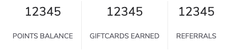 |
Other Stat | Displays a stat of your choice. You can select between a referral stat, various reward stats or build a custom stat. |
Common Components are widely used to enhance both functionality and design consistency across your widget or microsite. They cover general-purpose visual and structural elements like hero images, layout formatting, and descriptive program steps.
Component | Description |
|---|---|
Two Column Hero Image | A banner image and header text spanning two columns. The image, text, and background color can be updated.  |
Overlay Hero Image | A banner image with overlaid text. The image, text, and background color can be updated.  |
Image | A picture. The background color, alignment, height, and width can be changed.  |
Link Button | A clickable button that redirects participants to your selected link. Button color is controlled by the Brand Color set at the Brand Container level.  |
Program Explainer | A template explaining how an Advocate program works, like how to earn rewards. Includes two program explainer steps by default. More steps can be added. The color is controlled by the Brand Color set at the Brand Container level. 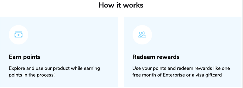 |
Program Explainer Step | Add descriptive text to explain part of your program. Fits within a program explainer component. The color is controlled by the Brand Color set at the Brand Container level. 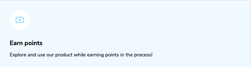 |
Program Timeline | Display an overview of the referral journey and rewards for your participants. Add or remove timeline entries as needed. The color of the circle icon and lines between entries is controlled by the Brand Color set at the Brand Container level. 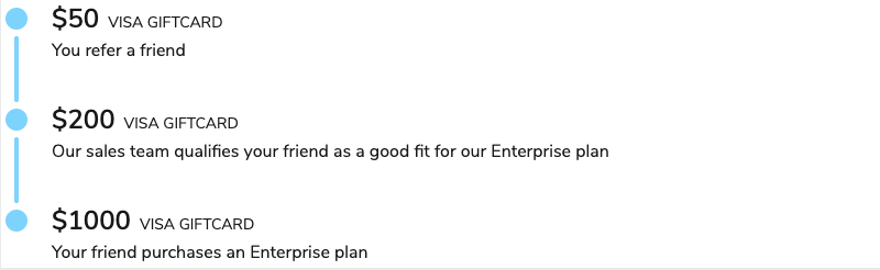 |
Timeline Entry | Fits within a program timeline component to show one step of the referral journey. The color of the circle icon and lines between entries is controlled by the Brand Color set at the Brand Container level.  |
User Name Display | Dynamically pulls in the participant’s full name. Defaults to “Anonymous User” if the participant has not entered a name.  |
Component | Description |
|---|---|
Task Card Feed | Task cards let your users perform actions or see progress toward Advocate program goals directly with the widget or microsite. This component adds multiple task cards to your widget or microsite. The button color is controlled by the Brand Color set at the Brand Container level. 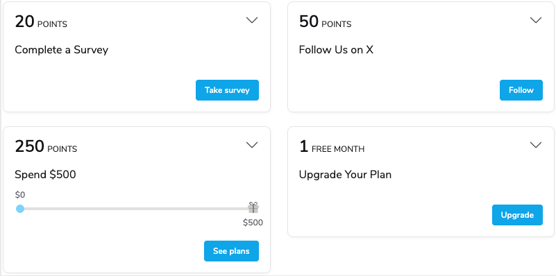 |
Reward Exchange | Allow participants to exchange earned rewards for another type of reward. You must have Reward Exchange set up to use this feature. 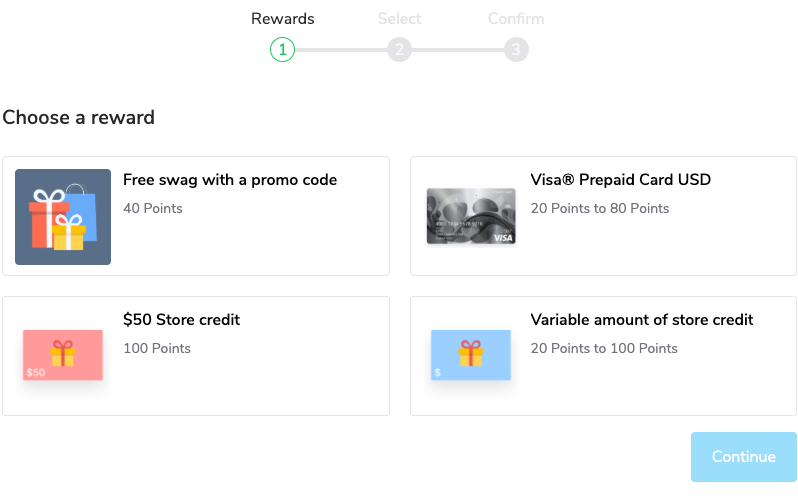 |
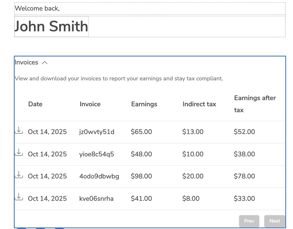
Reward Table | Display a list of rewards the participant has earned. Can include manual rewards and/or rewards earned across multiple Advocate programs. 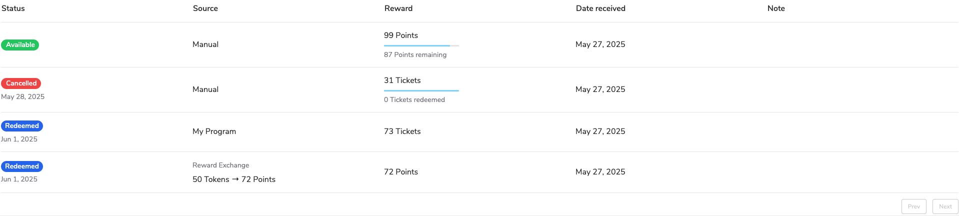 |
Customer Note Column | Add another note column to the reward table. Must be placed within the Reward table component. 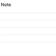 |
Date Column | Add another date column to the reward table. Must be placed within the Reward table component. 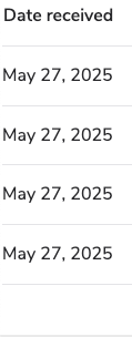 |
Reward Column | Add another reward column to the reward table. Must be placed within the Reward table component. 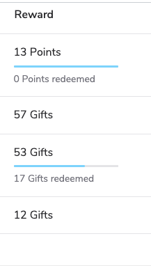 |
Source Column | Add another source column to the reward table. Must be placed within the Reward table component. 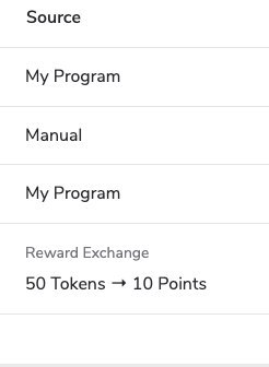 |
Status Column | Add another status column to the reward table. Must be placed within the Reward table component. 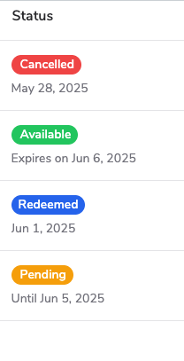 |
Microsite components are primarily used for your microsite’s registration form and navigation sidebar. These components cannot be added to program widgets.
Component | Description |
|---|---|
Form Checkbox Field | Add a checkbox to the registration form. You can map whether the box was checked to a custom field on the Advocate participant. Read View Your Microsite Registration Form Submissions for more information.  |
Form Dropdown Field | Add a dropdown list with customizable list items to the registration form. You can map the user's selected list item to a custom field on the Advocate participant. Contact Support for assistance with this. 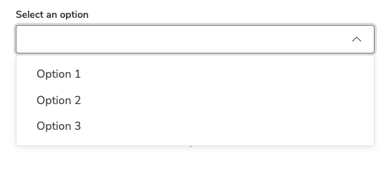 |
Form Input Field | Add a free-form text input field to the registration form. You can map the user's inputted text to a custom field on the Advocate participant. Contact support for assistance with this. 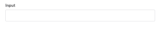 |
Form Name Fields | Add fillable First Name and Last Name fields to the registration form. 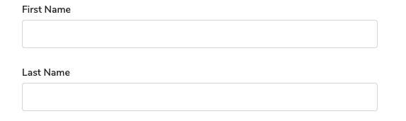 |
Sidebar Item | Add a new page or link to your microsite’s sidebar navigation. Can only be placed with the microsite’s Logged In Layout. 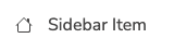 |
Form Password Field | Add a fillable password field to the registration form. 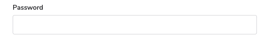 |
Instant Access components make it quick and easy for referred friends to sign up or redeem rewards without going through the standard registration process. They are ideal for programs using instant access referral widgets or friend registration flows.
Component | Description |
|---|---|
Coupon Code | Display a redeemable code for a Fuel Tank reward. The rewards fuel tank must have available coupon codes for this component to work as intended. 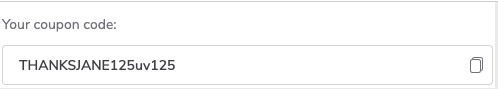 |
Advocate Registration | Allow new Advocates to enter their email address to register and make referrals. After entering their email address, users will be taken to a second screen where they can access their referral sharelinks. Used for the instant access Website Referral Widget. 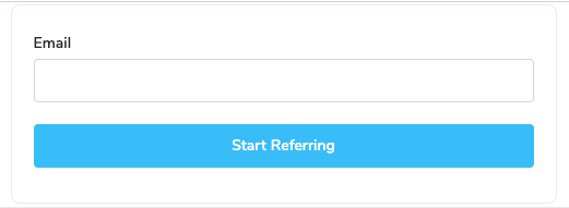 |
Sign out current user | Allow the viewer to exit the personalized instant access display. 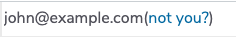 |
Friend Registration | Allow referred friends to enter their email address to register. After entering their email address, users will be taken to a second screen where they can access their Coupon Code reward. Used for the instant access Friend Widget. |
Layout components allow you to organize and group together other components. Use them to create sections, rows, columns, or tabs.
Component | Description |
|---|---|
Two Column Hero Layout | Add a hero layout featuring two columns of content.  |
Row Layout Container | Add a new row container for content. Other components can be placed within the row.  |
Column Layout Container | Add a new column container for content. Other components can be placed within the column. |
Tab | Add a new tab to a generic tab group. 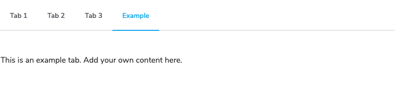 |
Generic Tab Group | Add a group of tabs. Each tab can contain distinct components and content. Has three tabs by default, but tabs can be removed or added as needed. 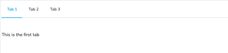 |
Tilted Section | Add a new section that contains a heading and paragraph text. Other components can be added to the Titled section under the heading.  |
Leaderboard
 This feature is only accessible to specific impact.com editions or add-ons. Contact us to upgrade your account and get access!
The Leaderboard component allows you to rank your program participants, offer rewards to top performers, and incentivize participants to drive greater results in your program. Add leaderboards to your verified access widget or microsite, and configure the scoring system, ranking system, and participant filtering options. See the articles below for more information:
Component | Description |
|---|---|
Referral Started | This type of leaderboard ranks participants by the number of referrals they've initiated. Your customer advocates' scores will correspond with the number of initiated referrals. 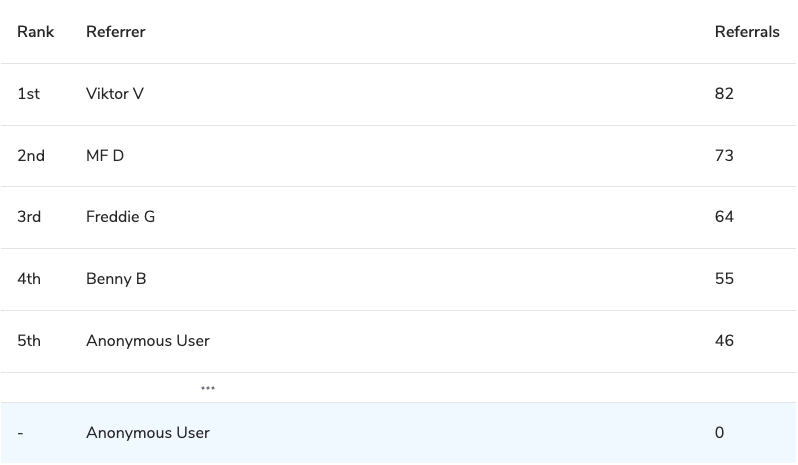 |
Referral Converted | This type of leaderboard ranks participants by the number of referrals they've converted. Referrals are regarded as converted once the referred friend achieves a program goal, such as making a purchase of a value you've defined. Your customer advocates' scores will correspond with the number of converted referrals. |
Points Earned | This type of leaderboard ranks participants by the total number of Points they've earned in Advocate programs that reward Points. All reward unit Points count as long as they aren't pending or canceled. This leaderboard type is only valid for the Point reward type. 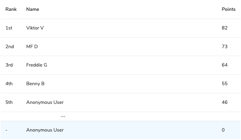 |
Anonymous Leaderboard | A completely anonymized version of the leaderboard which does not display any personally identifying information about other program participants. Can display any leaderboard type. 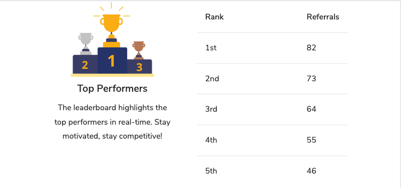 |
Tax and Cash
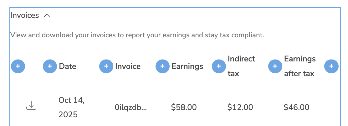
This feature is only accessible to specific impact.com editions or add-ons. Contact us to upgrade your account and get access!Tax and cash components let you incorporate tax form collection and cash payout options in your verified access widget or microsite.
This component group is only available if the cash payouts feature has been turned on for your account.
Component | Description |
|---|---|
Payout Status Alert | Alert the participant of actions they need to take before they can receive a cash payout. The component includes a call-to-action button that takes the participant to review their payout settings. Optionally, customize any of the text descriptions the participant will see when they view the component. 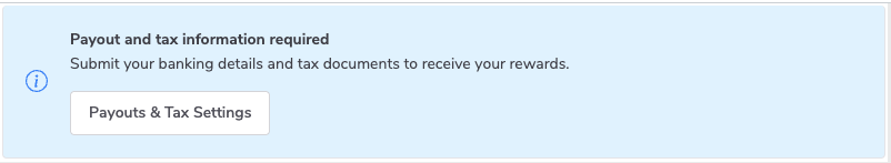 |
Microsite & Widget Cash Payout Form | Insert a form that collects participants' banking information and any applicable tax forms, like a W-8 or W-9. Optionally, customize any of the text descriptions the participant will see when they view the form. You can also set verification alerts and requirements within this component. 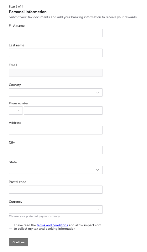 |
Sharing components give participants convenient ways to promote their referral links and codes across multiple channels. When a participant clicks a sharing button, it opens the chosen channel, such as Facebook, LinkedIn, WhatsApp, or email, with a pre-filled message or link, ready to send.
Some components, like Referral Code, display the participant’s individual referral or promo code along with a copy-to-clipboard option for quick sharing. Others, like Promo Codes, present multiple available codes (if allocated) in a slider view, and include sharing buttons so participants can instantly post or send the selected code. These tools make it simple for participants to spread the word and drive new referrals.
Component | Description |
|---|---|
Referral Code | Display a referral code field with a copy to clipboard option. Used as part of the Promo Codes functionality. 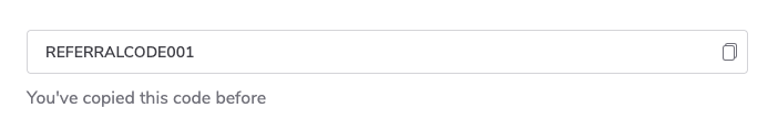 |
Promo Codes | Pre-formatted component block that includes referral promo code field with slider to toggle between various codes if more than one has been allocated. It also includes a share link, and Facebook, LinkedIn, and Twitter / X share button components. 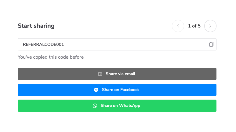 |
Facebook Share Button | Display a Share on Facebook button with customizable text. When clicked, the button will redirect to a new post on the user's Facebook profile with the brand's Social Messaging pre-loaded.  |
X Share Button | Display a Share via X button with customizable text. When clicked, the button will redirect to a new post on the user's X account with the brand's Social Messaging pre-loaded.  |
Email Share Button | Display a Share via Email button with customizable text. When clicked, the button will open the user's default email application and start a new email with the brand's Social Messaging pre-loaded.  |
Mobile Share Sheet Button | Display a button to share within the participant’s web browser. When clicked, the button will open a menu listing all available apps the user can open to share their link. When an app is selected, a new post or message will be created with the brand's Social Messaging pre-loaded.  |
LinkedIn Share Button | Display a Share on LinkedIn button with customizable text. When clicked, the button will redirect to a new post on the user's LinkedIn profile with the brand's Social Messaging pre-loaded.  |
SMS Share Button | Display a Text a friend button with customizable text. When clicked, the button will redirect to the user's default SMS/text messaging app, and a new SMS/text message will be created with the brand's Social Messaging pre-loaded.  |
Messenger Share Button | Display a Share via Messenger button with customizable text. When clicked, the button will redirect to a new message on the user's Facebook Messenger app with the brand's Social Messaging pre-loaded.  |
WhatsApp Share Button | Display a Share via WhatsApp button with customizable text. When clicked, the button will redirect to a new message on the user's Whatsapp account with the brand's Social Messaging pre-loaded.  |
LINE Share Button | Display a Share via Line Messenger button with customizable text. When clicked, the button will redirect to a new message on the user's Line Messenger app with the brand's Social Messaging pre-loaded. 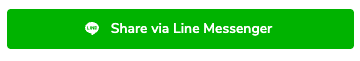 |
Pinterest Share Button | Display a Share on Pinterest button with customizable text. When clicked, the button will redirect to a new post on the user's Pinterest profile with the brand's Social Messaging pre-loaded.  |
Share Link | Display the participant’s share link for this program. 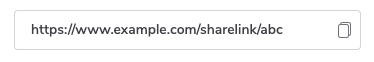 |
QR Code | Display the participant’s share link in the form of a QR code for this program. 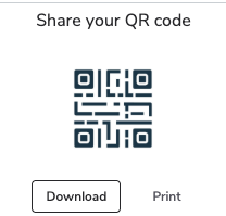 |
Referral components display information about the participant’s referred friends and their conversion status. They make it easy for participants to track who they’ve referred, when conversions happened, and any rewards earned from those referrals.
Component | Description |
|---|---|
Referral Card | Pre-formatted component block that includes program timeline, share link, and Facebook, LinkedIn, and Twitter / X share button components. Can add or remove other components as needed. 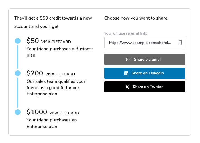 |
Referral Table | Display a table showing the participant’s referred friends, conversion date, and conversion status. 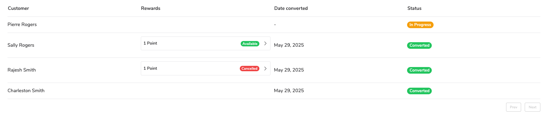 |
Referral Table Date Column | Add another date column to the referral table. Must be placed within the Referral table component. 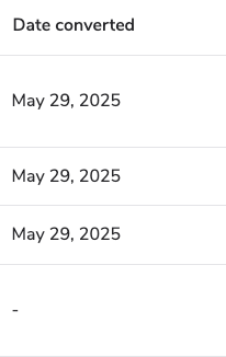 |
Referral Table Rewards Column | Add another rewards column to the referral table. Must be placed within the Referral table component. 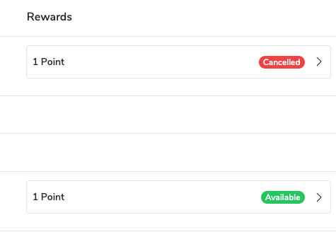 |
Referral Table Status Column | Add another status column to the referral table. Must be placed within the Referral table component. 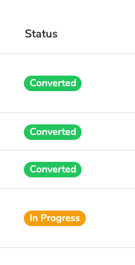 |
Referral Table User Column | Add another customer (referred friend) column to the referral table. Must be placed within the Referral table component.  |
Advanced components give you more control over what participants see and when they see it. They allow conditional display of content, program overrides, and other specialized configurations that help tailor the experience for specific audiences.
Component | Description |
|---|---|
Conditional Area / Segment | Display content in this section only when the participant belongs to a certain user segment. To set the user segment, open the component’s properties and edit the JSONata expression in the Condition field. Users within the set segment will see all content displayed in the conditional section, while users not in the segment will not see the content.  |
Conditional Area / Field | Display content in this section only when a custom field on the participant’s profile contains a certain value. To set the custom field name and value, open the component’s properties and edit the JSONata expression in the Condition field. Users with the correct custom field value will see all content displayed in the conditional section, while users without the correct custom field value will not see the content. |
Program Section | The program section component allows you to override the program ID of its child components. Use it when you want to display content that isn’t linked to a specific program. Included by default in most widget and microsite templates. |